TRINITY ST. PAUL’S UNITED CHURCH
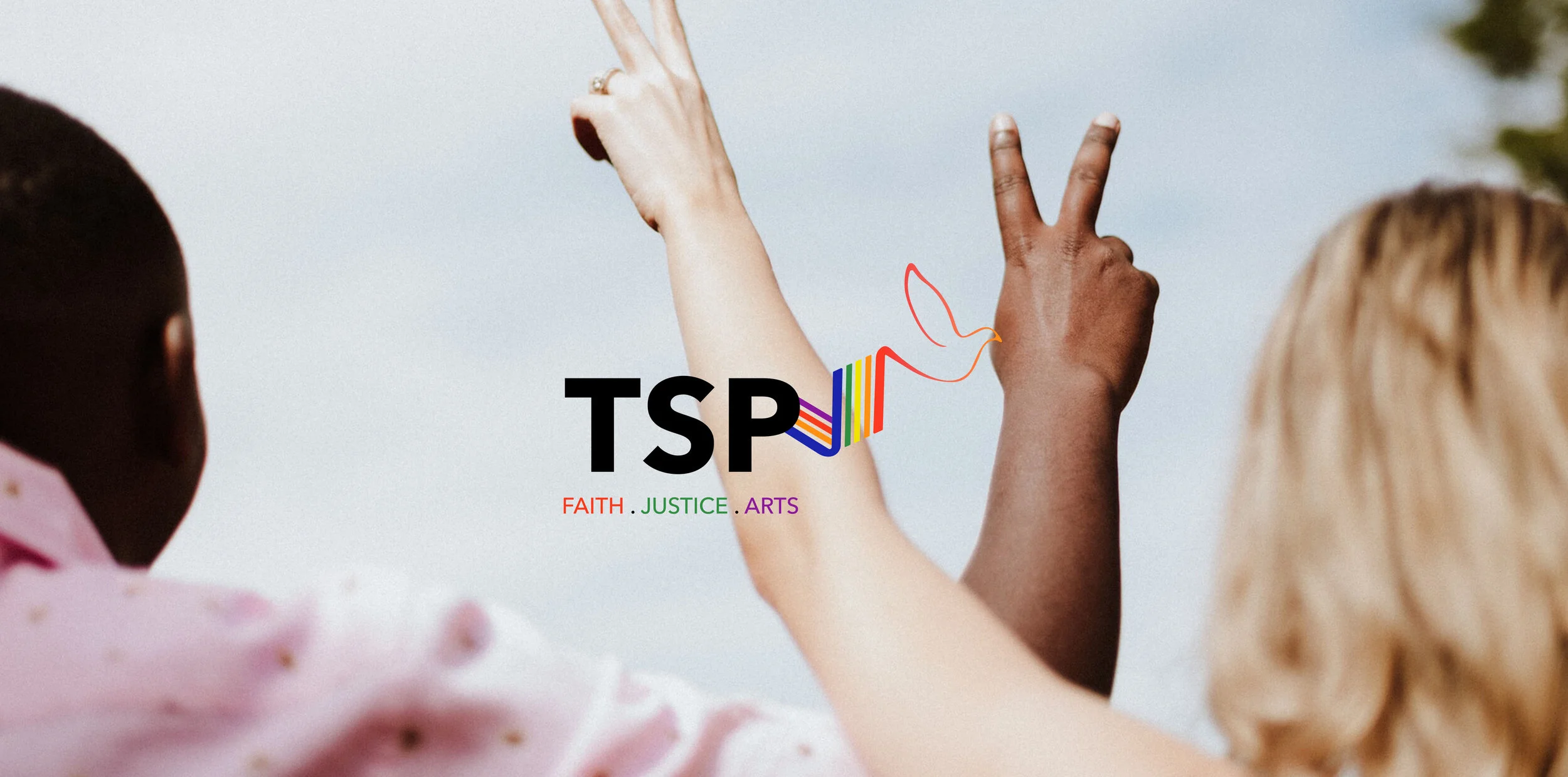
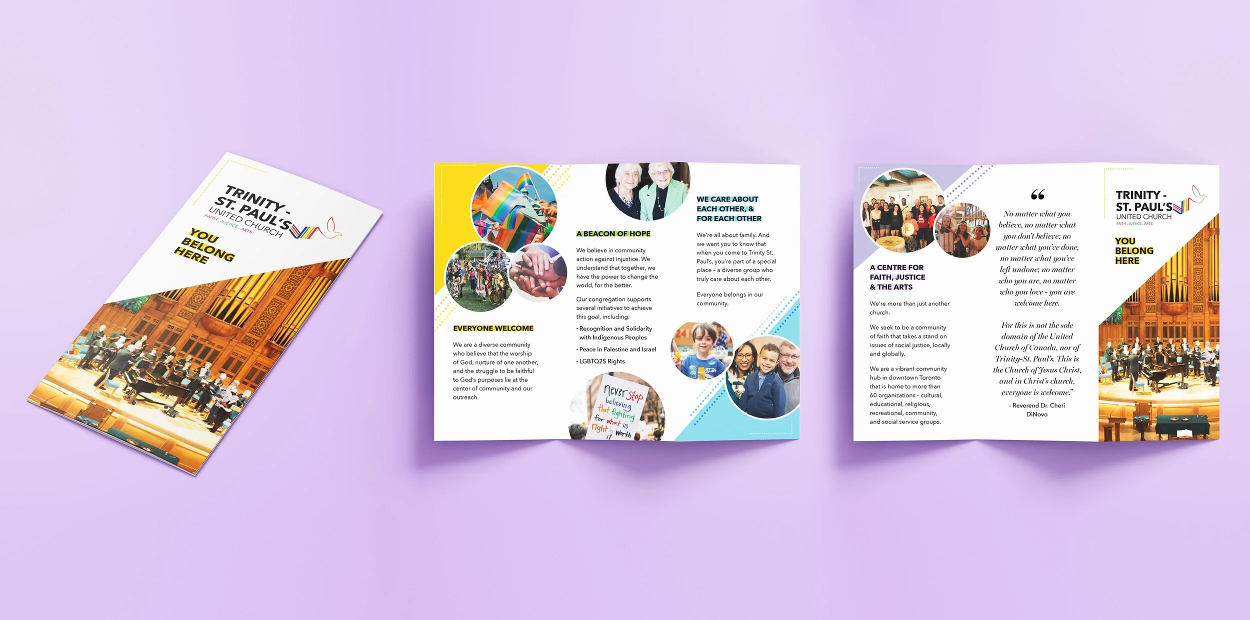
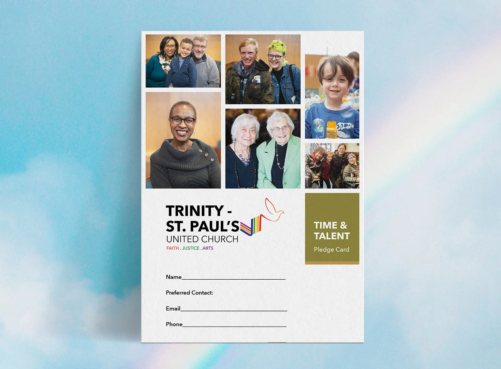
Located in the heart of the Annex, TSP wanted to update their visual identity so that it reflected more of their brand messaging. They affirm that all who seek to live faithfully regardless of ability, age, class, ethnicity, gender, race or sexual orientation are full participants. The rainbow in the logo represents this and the dove symbolizes that it’s carrying this message into the world.
|
branding, marketing material


